bettermarks Design System
Modernizing bettermarks' existing component library to scale design and development
bettermarks Design System
Modernizing bettermarks' existing component library to scale design and development
Client
bettermarks
Project Type
Design System & Component Library
Tasks & Services
UX/UI Design, Frontend Development
The Challenge
By 2022, bettermarks’ custom component library—`bm-ui-components`—had become a bottleneck. What started as a practical solution for building our educational platform had evolved into a system that couldn’t keep pace with our growing needs.
The core problem: Our design and development cycle was too slow, accessibility requirements were mounting, and we were building components reactively rather than working from a comprehensive, scalable system.
I recognized that continuing down this path would only compound our challenges. We needed a fundamental shift in how we approached UI development.
Identifying the Pain Points
I conducted a thorough audit of our existing component library and gathered feedback from both designers and developers to understand where the system was failing us.
Development Inefficiencies
- Extremely slow design-to-development cycle preventing us from responding quickly to new requirements
- Components were built on-demand rather than drawn from a complete, ready-to-use library
- Most components were app-specific rather than universal, creating duplication and inconsistency
- No theming capabilities—styling was hardcoded into components with no external customization
- Poor separation between styling and presentation logic
Design Limitations
- No unified design system—each new feature required custom component design
- Limited consistency across different applications
- Weak responsive design patterns
- No support for theming or color modes
Critical Compliance Gaps
With upcoming mandatory accessibility requirements (Gebrauchstauglichkeitsgutachten and BIK WCAG-Test), our library was fundamentally unprepared:
- Missing ARIA attributes and screen reader optimizations
- Non-semantic HTML markup
- Insufficient color contrast, particularly for colorblindness
- Poor keyboard navigation support
- Limited mobile device optimization
The gap between where we were and where we needed to be was significant—and widening.
Research & Evaluation
Rather than attempting to rebuild our custom library, I proposed evaluating established
open-source component libraries that could provide the foundation we needed while allowing
customization for our brand and requirements.
I compared UI libraries for coverage, accessibility, theming, and DX, rejected Material UI and Ant for fit, and selected Chakra because it delivered accessible components out of the box, a flexible theming system with color modes, strong documentation and Figma tooling, and a TypeScript-friendly, composable architecture that kept customization practical and future-proof.
Convincing the Developer Team
Having identified Chakra UI as the solution, I needed to convince our developer community to
undertake a significant migration. Developers understandably have concerns about adopting
new technologies, especially when it means replacing working code.
Strategy: Spike Demo
I built a Next.js prototype integrating both our existing bm-ui-components and
Chakra UI with real product data. This proved the libraries could coexist during migration—enabling
a gradual, low-risk transition—while showcasing Chakra UI’s advantages through direct
side-by-side comparison.
- Library Component Prototype: Recreated complex library selection interfaces, Demo
- bettermarks Center Login: Rebuilt our authentication flow
Presentation to Developer Community
I presented a comprehensive case covering:
- Pain points in our current system (with specific examples developers recognized)
- Evaluation process and why alternatives were rejected
- Live demonstration of the spike prototypes
- Migration strategy and timeline
- Developer experience improvements (better DX = faster shipping)
The combination of clear problem framing, thorough evaluation, and working proof-of-concept
convinced the team. The migration was approved.
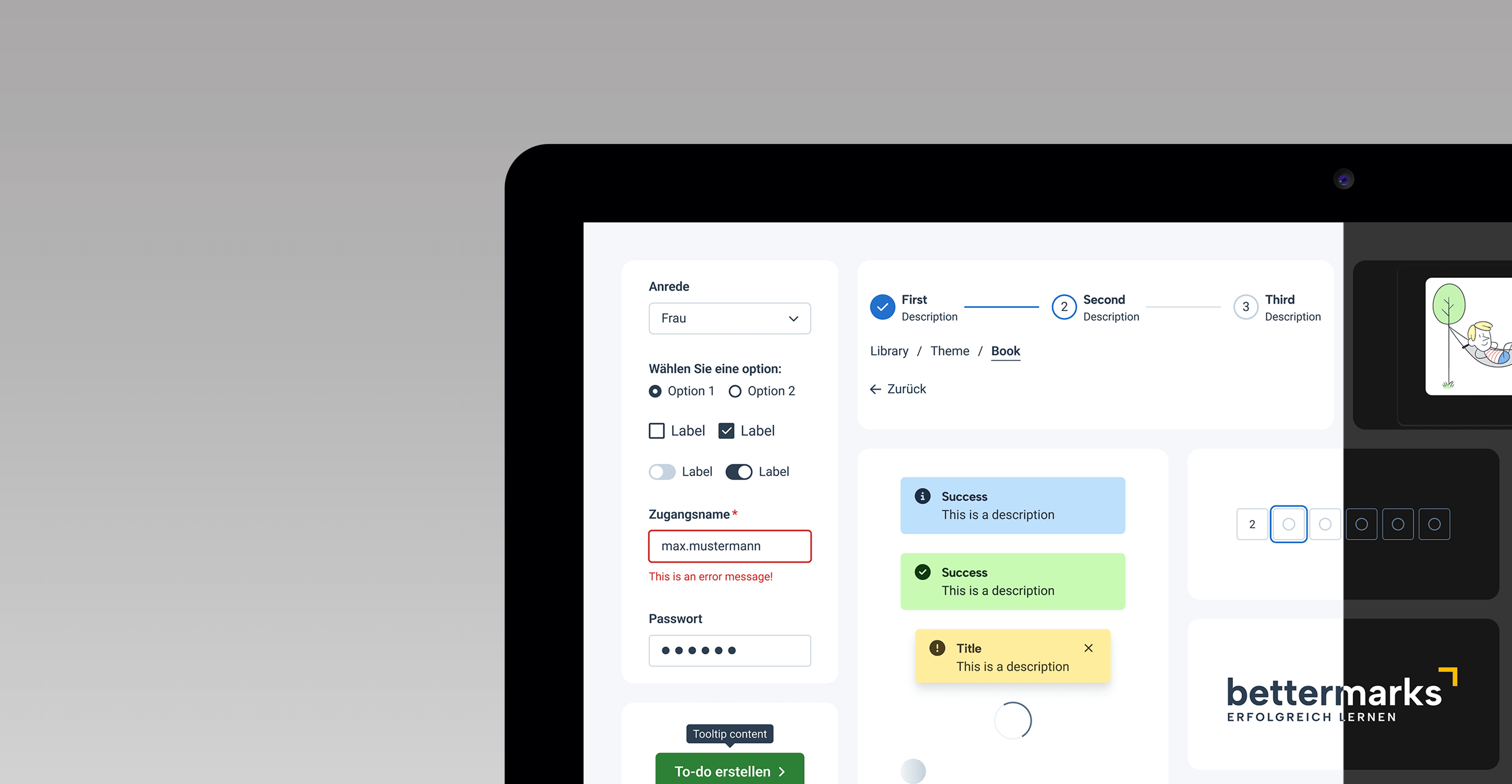
Design System Implementation
Figma Component Library
- Extended the Chakra UI Figma kit with bettermarks-specific customizations
- Adapted components to match our brand guidelines and design vision
- Created bettermarks-specific variants for educational contexts
- Documented component usage patterns and composition guidelines
- Established semantic token system for theming (colors, spacing, typography)
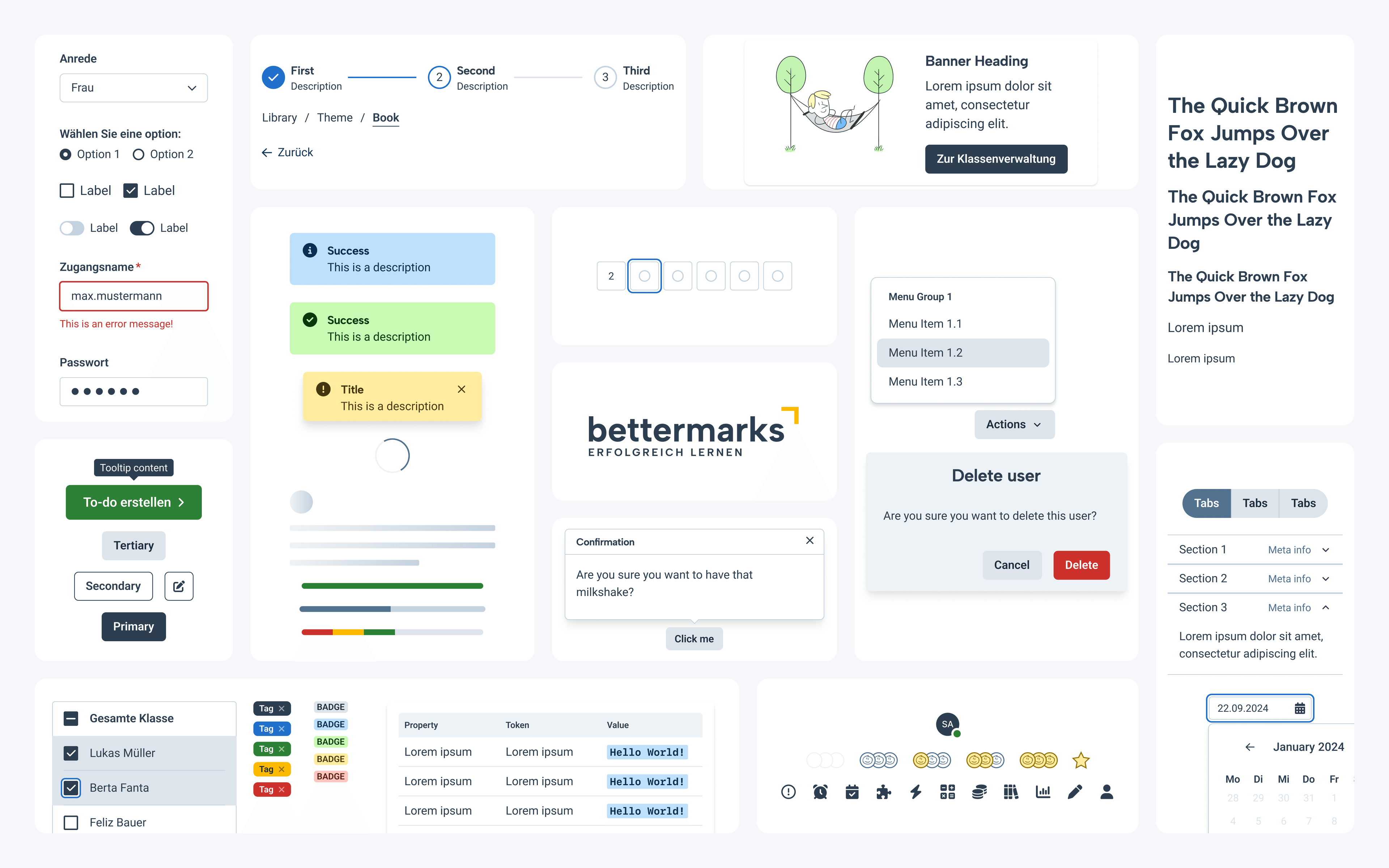
Overview of the component library
Design-to-Development Bridge
- Maintained naming parity between Figma components and Chakra UI code components
- Created documentation linking design decisions to implementation
- Established workflow where designers could build screens using the kit with confidence
that developers could implement them efficiently
Storybook Integration
- Worked with developers to document all components in Storybook
- Created interactive examples showing component states and variations
- Provided a shared reference point between design and development
- Enabled designers to verify implementation matched design intent
Outcome & Impact
The migration to Chakra UI fundamentally transformed how bettermarks approached UI development.
Immediate Improvements
- Dramatically faster design-to-development cycle with ready-to-use, accessible components
- Consistent UI patterns across all applications
- Built-in accessibility compliance (ARIA, semantic HTML, keyboard navigation, screen reader support)
- Theming capabilities enabling light/dark modes and future customization
- Responsive design patterns that worked consistently across devices
- Improved color contrast and colorblindness considerations by default
Design Process Evolution
- Designers could now build complete screen designs using a comprehensive component library
- Handoff became significantly simpler with shared language between design and code
- Reduced back-and-forth between design and development
- New features could be composed from existing components rather than requiring custom builds
Developer Experience
- Access to 51+ well-documented, TypeScript-ready components
- Extensive utility hooks reducing custom code
- Strong community support and resources for problem-solving
- Better code consistency and maintainability
Strategic Positioning
- bettermarks was prepared for mandatory accessibility audits
- Scalable foundation for future product development
- Reduced technical debt and maintenance burden
- Created reusable patterns that accelerated all future work
Key Takeaways
- Systems thinking beats incremental fixes. Rather than patching our custom
library, stepping back to evaluate the fundamental approach yielded far better results. - Show, don’t tell. The spike demo was more convincing than any
presentation could have been. Working prototypes demonstrate feasibility and build confidence. - Accessibility shouldn’t be an afterthought. Choosing a library with
accessibility built-in ensured compliance by default rather than requiring constant vigilance. - Design and development alignment is a force multiplier. When designers and
developers share the same component language, everything moves faster and with less friction.