DAK
Designing a Wordpress platform concept and logo proposal for an artist-led DAO
DAK
Designing a Wordpress platform concept and logo proposal for an artist-led DAO

Client
Nick Koppenhagen
Project Type
Wordpress Platform
Tasks & Services
UX/UI Design, Frontend Development
The Challenge
By the end of 2018, my cousin and artist Nick Koppenhagen approached me with an ambitious idea: to bring his vision for DAK—short for “Decentralized Autonomous Kunstverein”—to life as a website and platform (WordPress CMS), and to participate in the open contest for the site’s logotype.
DAK was conceived as an art association organized as a decentralized autonomous organization (DAO): a community-driven structure meant to promote fine arts and experimental contemporary art through exhibitions, presentations, screenings, and public programs. The organization’s governance and funding are intentionally transparent and rule-based, defined through its bylaws and executed through member participation and voting.
Links: https://dak.international/ · https://dak.gitbook.io/dak-bylaws/
The core design problem: Explain a novel, somewhat “technical” organizational model in a way that feels inviting, credible, and culturally fluent—without turning the website into a Web3-only insider space.
Research & Requirements
To ground the work, I started by reading through the DAK bylaws to understand the project beyond aesthetics—especially the mission, the governance model, and the practical steps for participation.
What DAK needed to communicate clearly
- A concise mission: promote fine arts and inspire interest in experimental contemporary art
- The non-profit nature of the initiative (funds used only in line with the bylaws)
- How decisions are made (General Assembly, Coordinating Board, member voting)
- How participation is recognized (voting tokens and allocation logic)
- How projects get proposed and funded (proposal flow and supporting materials)
Design Requirements
- Editorial-first layout that feels like an art institution, not a startup pitch deck
- Fast comprehension: “What is DAK?” in the first screen
- Clear pathways for different audiences (artists/curators, members, public visitors)
- WordPress-friendly structure (pages, posts, reusable blocks, easy maintenance)
- Strong typographic foundation that can carry long-form text (bylaws, proposals, updates)
Design Exploration
The website work focused on shaping a simple, scalable structure that could carry both editorial content and governance documentation without feeling overwhelming.
Information Architecture
- Drafted a small set of core sections (Mission, How It Works, Join, Proposals, Archive/News)
- Explored page templates for long-form governance content vs. editorial announcements
- Considered how to surface participation flows (Discord, proposal submission, assemblies) without overwhelming first-time visitors
Why the direction held up: The best concepts didn’t “explain the DAO” through decoration—they established trust through clarity and restraint, then let the content do the convincing.
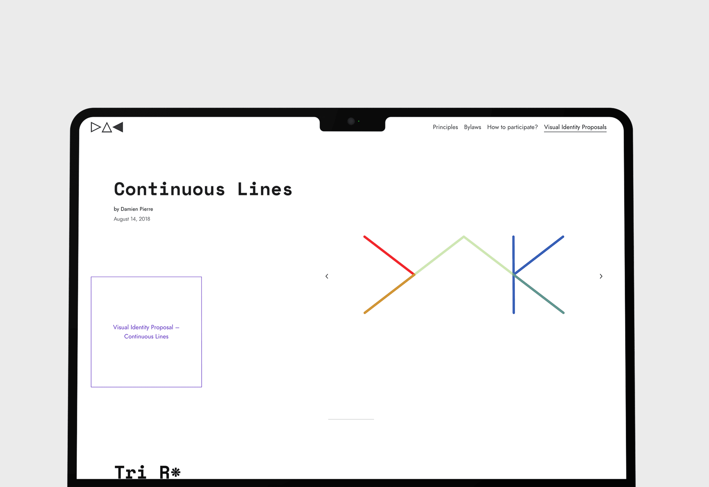
Logotype Design
In parallel to the website concept, I joined the open logotype contest for the DAK website. The goal was to create a mark that feels credible in an art context while subtly acknowledging the “decentralized” aspect—without defaulting to crypto visual clichés.
Logotype Iterations
- Typographic directions: strict institutional wordmarks vs. more humanist, cultural tones
- System ideas: modular or “token-like” construction to hint at governance mechanics
- Legibility checks across contexts (favicon, social previews, header lockups)

Final Design
The final proposal centered on a minimal, editorial website language: strong typography, generous whitespace, and a clear hierarchy that lets readers move from “What is DAK?” to “How do I participate?” in a few steps.
Key elements of the concept
- A mission-led landing page with a short, plain-language introduction
- A “How it works” section translating governance into readable steps
- A proposal pathway designed around transparency and documentation
- A WordPress structure intended for longevity: easy updates, consistent templates, and content-first design
Development
To keep the development workflow as predictable as possible across environments, I built the project on the Roots.io stack: Trellis + Bedrock + Sage.
Why this stack
- Trellis automated provisioning and deployments of a production-grade WordPress LEMP setup, with a strong focus on development/staging/production parity.
- Bedrock provided a modern WordPress project structure with Composer-based dependency management and environment-specific configuration.
- Sage served as a clean starter theme foundation so the front-end could be developed with a more modern, component-oriented workflow.
What it enabled
- A fully local, offline WordPress CMS backend for content editing and iteration
- A simpler deploy workflow to staging and production with fewer “it works on my machine” surprises
- More confidence that what shipped matched what was tested locally
Outcome & Impact
This project was an early-stage collaboration, so the most meaningful impact was exploratory: translating a governance-driven art initiative into a coherent web narrative and producing a serious logotype entry for the public contest.
What was delivered
- A structured website concept aligned with the DAK mission and governance model
- A logotype proposal tailored for digital-first usage (website, social, documentation contexts)
Key Takeaways
- Designing for trust starts with structure: clear hierarchy beats clever metaphor.
- Governance-heavy projects need “translation layers” for new audiences.
- Even though my logotype wasn’t selected, the work was genuinely rewarding—and a lot of fun—because it combined cultural context, systems thinking, and close collaboration with an artist.