Function Plotter Gizmo
Solving complex mathematical formulas on mobile devices
Client
bettermarks GmbH
Project Type
UI/UX
Tasks & Services
UI/UX Design, Prototyping, Usability Testing
Final version
The Project
In early 2019, shortly after I started working at bettermarks, an AI-powered adaptive online learning platform for mathematics, I encountered a critical challenge involving exercises that used the function plotter “gizmo”, a combination of UI elements designed to generate graphs from equations.
As data revealed a dramatic global increase in bettermarks usage on mobile devices, we discovered a significant issue: none of our users could solve exercises using the function plotter gizmo on mobile platforms. The root cause was clear: the UI had been developed for desktop computers at a time when mobile devices were not widely used, and it had never been optimized for smaller screens.
This presented a unique opportunity to address a major technical limitation and pain point for our users, while also potentially increasing mobile engagement. For me, it was the perfect project to showcase my expertise in responsive web design and mobile UI optimization.
Problem Solving
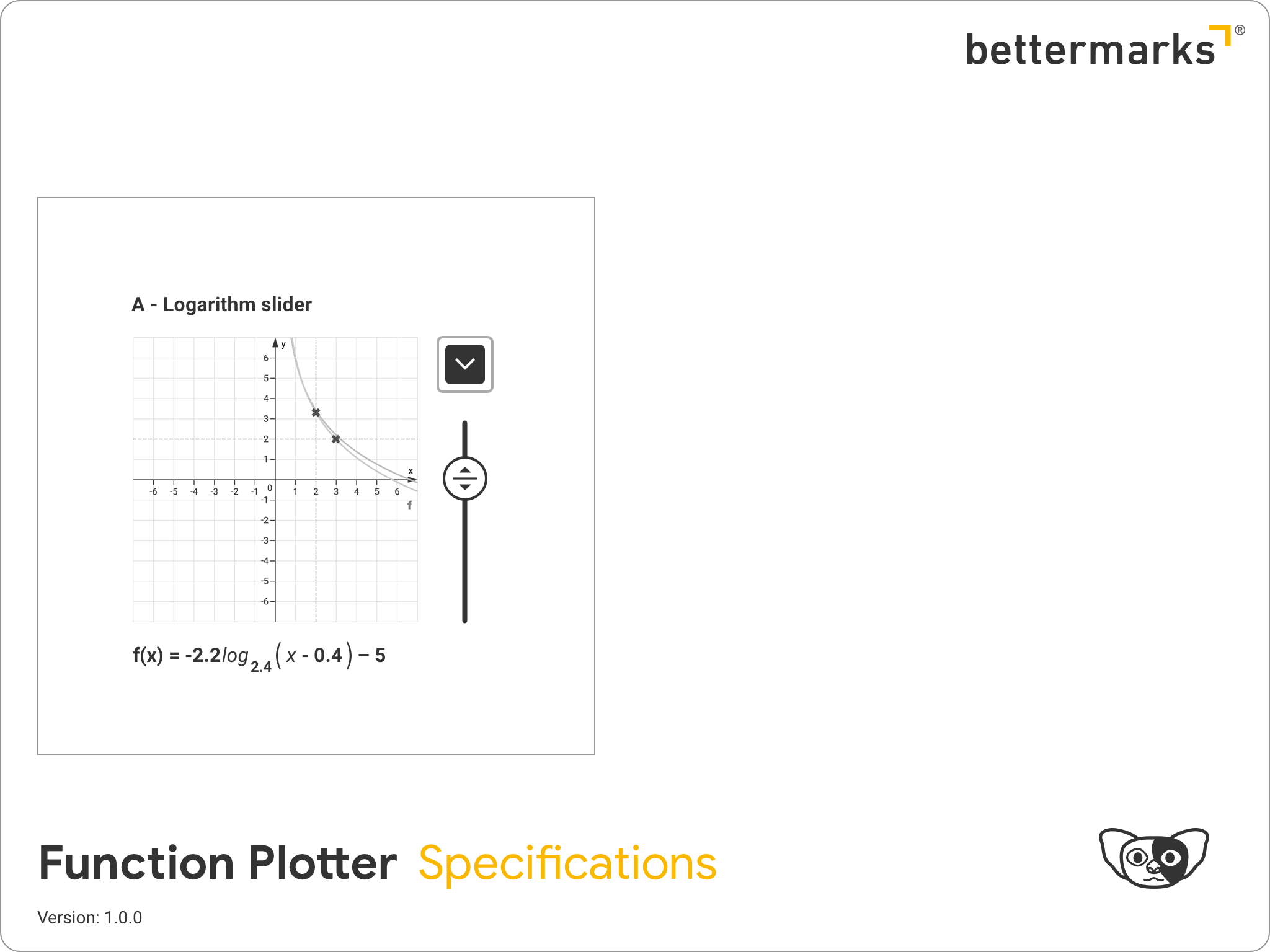
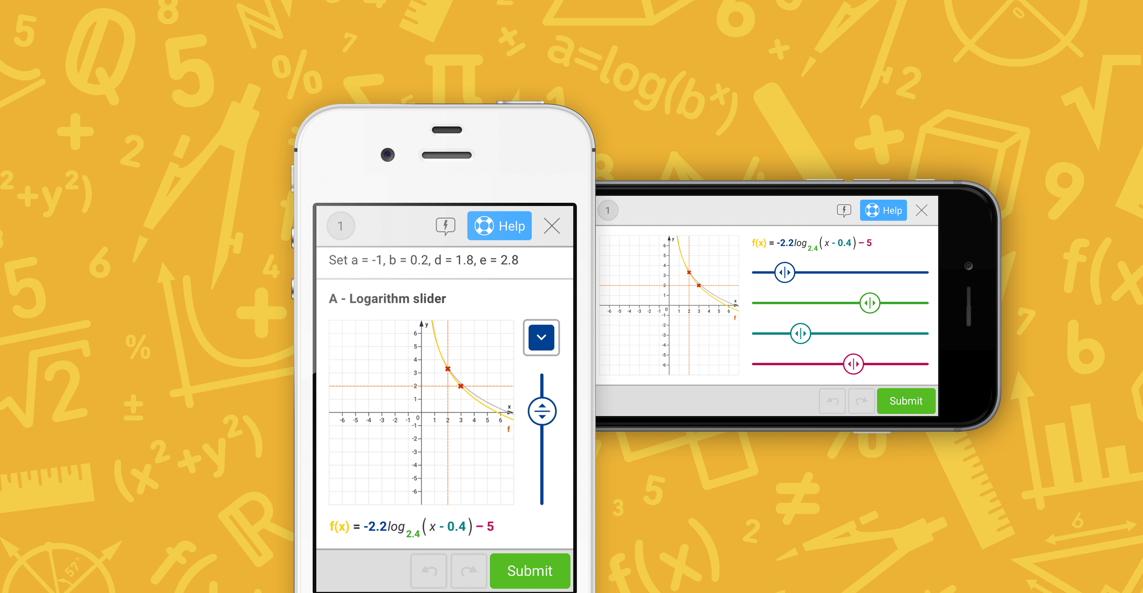
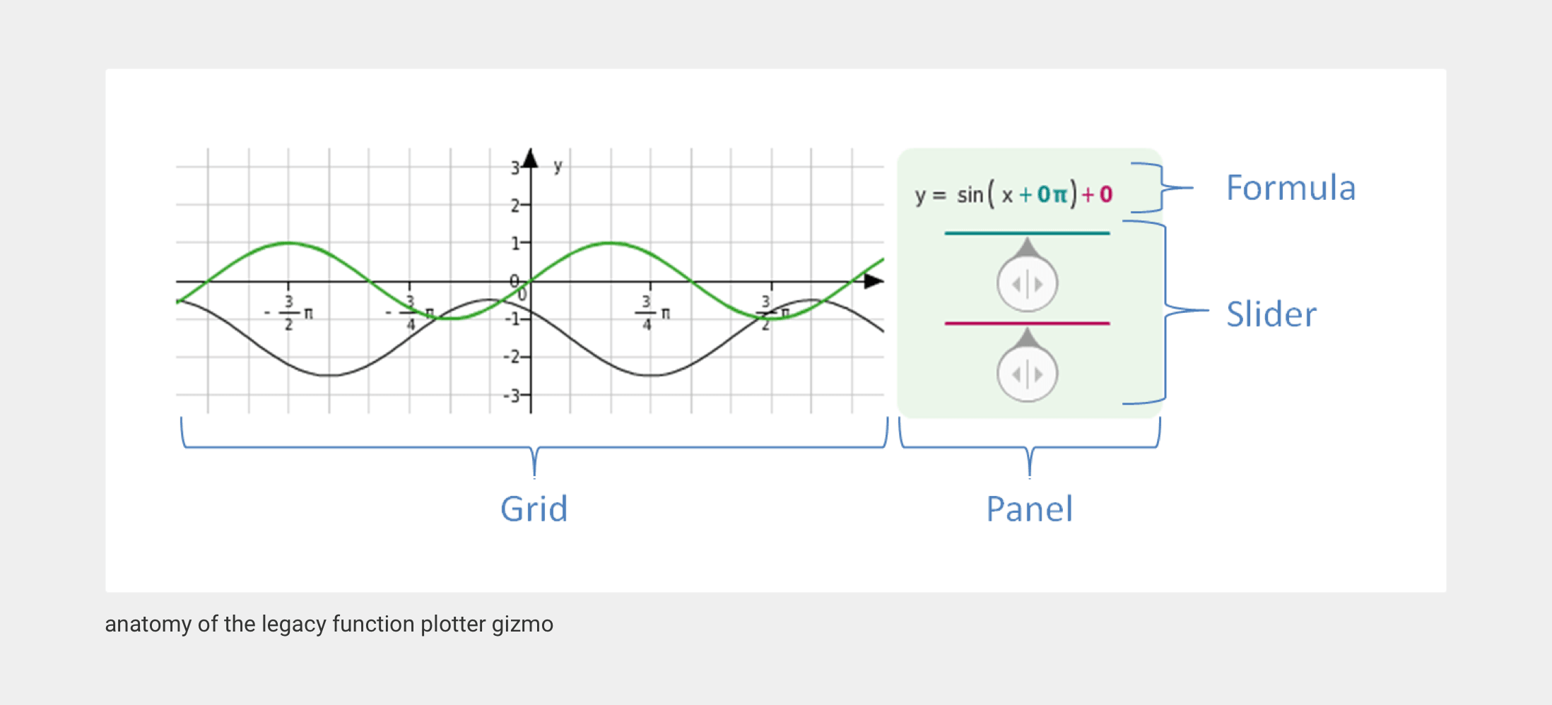
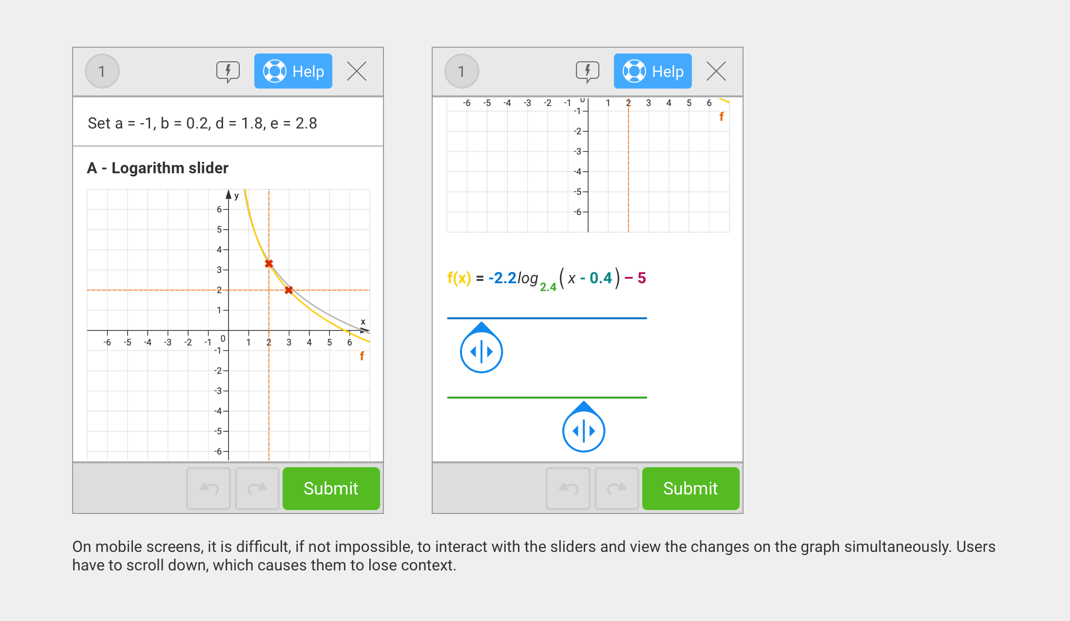
A function plotter is a tool that takes a mathematical equation and generates a visual graph on a coordinate plane, enabling users to observe a function’s behavior without manual calculations. The key challenge was ensuring that users could interact with the UI while simultaneously viewing changes on the graph. This was a requirement that was particularly difficult to meet on mobile devices.
The most complex aspect of this project wasn’t just optimizing the UI, it was reimagining how users could effectively solve function plotter exercises on mobile devices, where screen real estate is limited.
Insights & Requirements
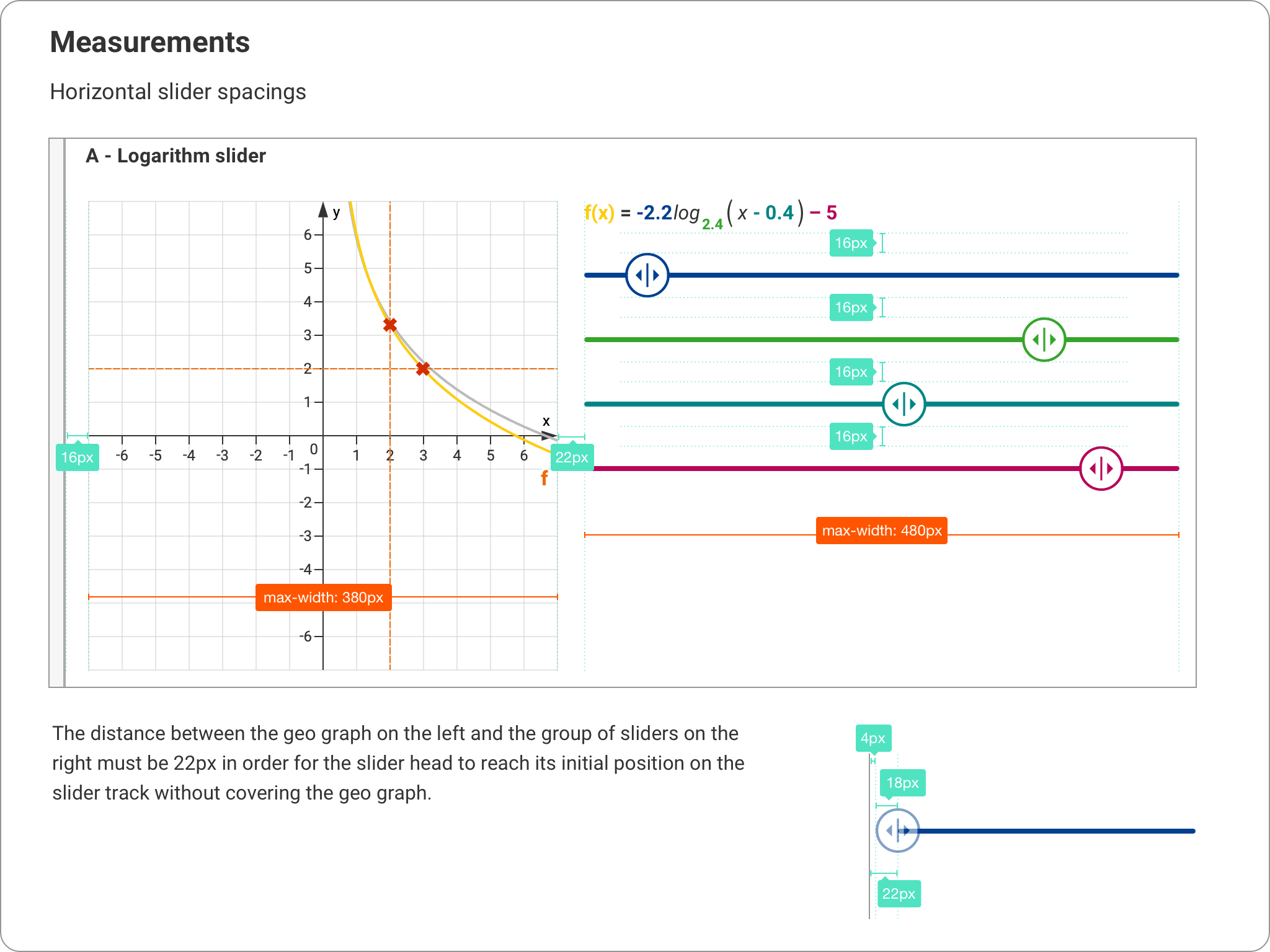
I began by leveraging Mixpanel to analyze device and screen resolution data. This analysis led me to establish a minimum required device resolution of 320×480 pixels, equivalent to that of an iPhone 4. Ensuring compatibility with this device meant the new gizmo would work for all our mobile users. In 2019, devices like the iPhone 4 were still widely used in our active user base, particularly in regions where larger phones were less affordable. Identifying this minimum requirement was crucial for inclusive design.
Next, I gathered further insights to cover all possible use cases and defined the following requirements for the new gizmo:
- The graph and its controlling UI must be concurrently visible. Scrolling or navigating away from the view to access the UI was not acceptable.
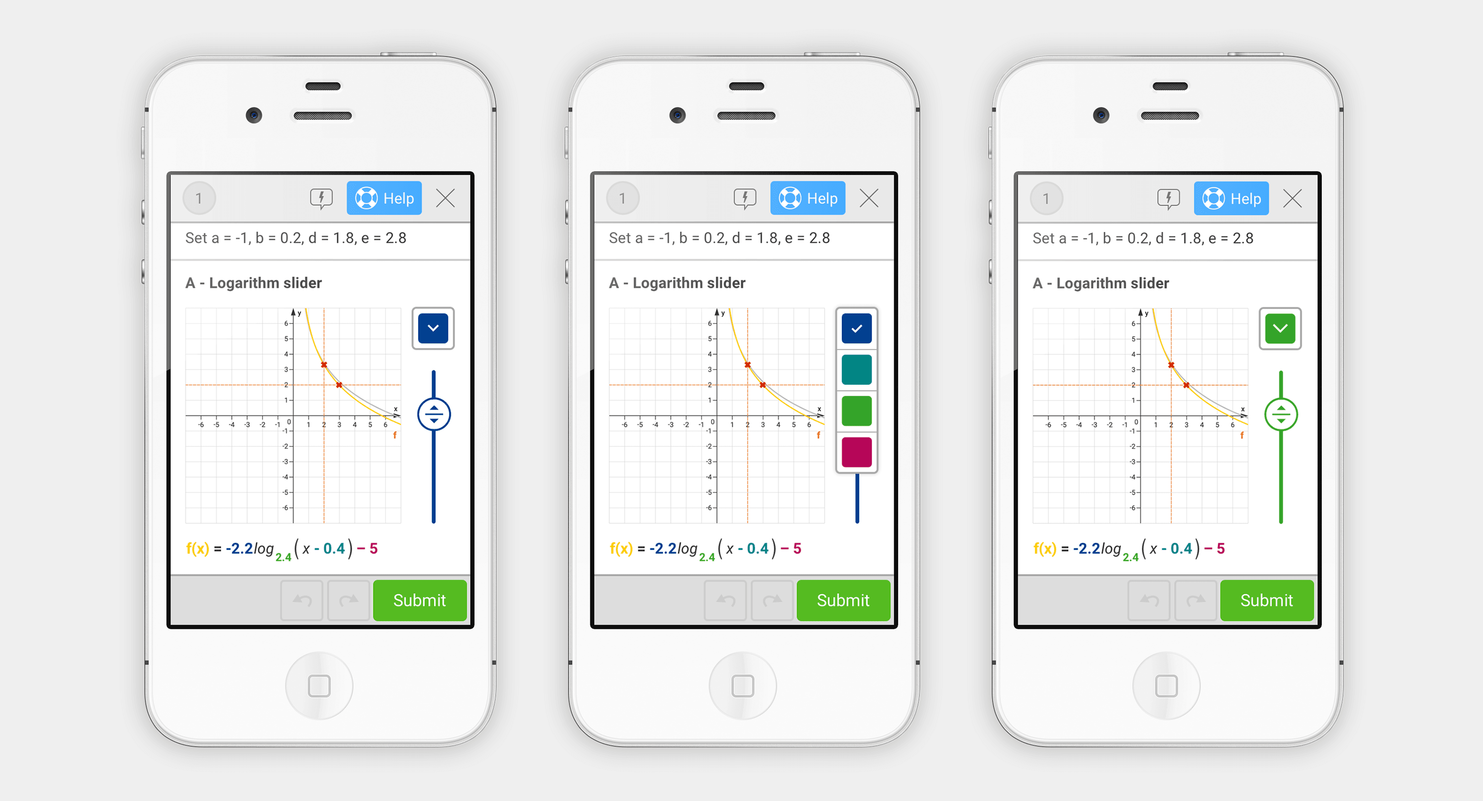
- The UI should support both single and multiple inputs for single and multiple curves.
- It should include color-coded inputs for better usability.
- In cases of multiple inputs with the same color, users should be able to distinguish between them.
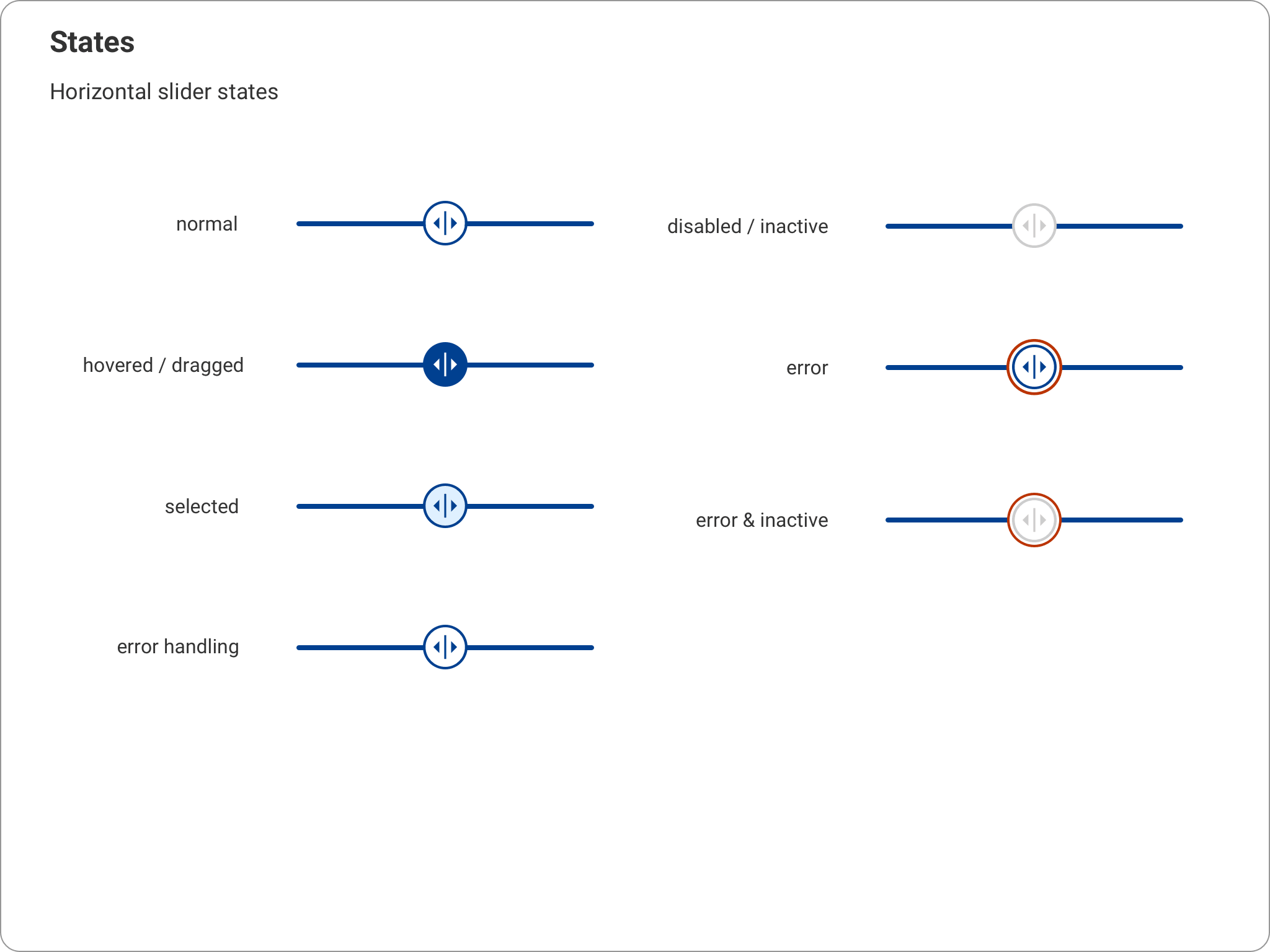
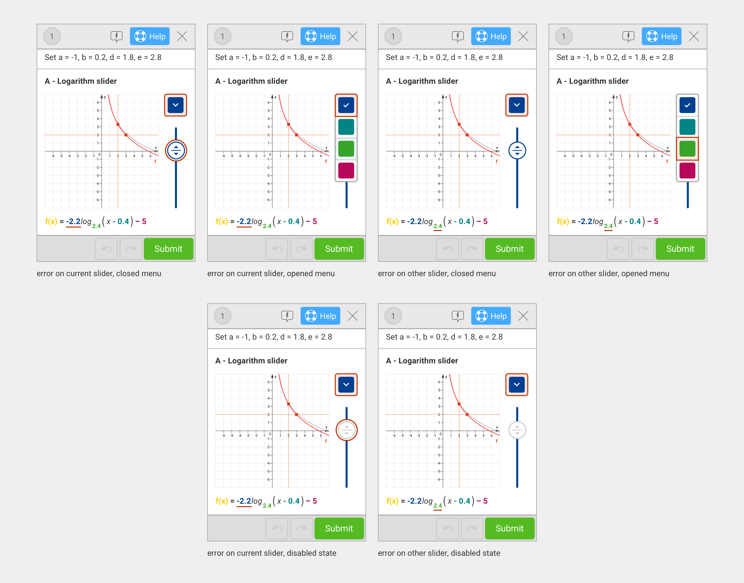
- It should function identically to the desktop variant, supporting the same states (error, inactive, error & inactive).
- It should adaptively display a compact version for small screens and an extended version for larger screens or horizontal orientations.
Design Iteration Loop
With the requirements in place, I moved into the design phase. To address the challenge of fitting the UI on small screens, I developed a gizmo featuring a dropdown that controlled one or multiple sliders, along with a layout capable of displaying both elements simultaneously. I then iterated on this concept through multiple feedback loops with colleagues and prototype testing with students. This process allowed me to refine the design and eliminate variants that did not fully meet all requirements.
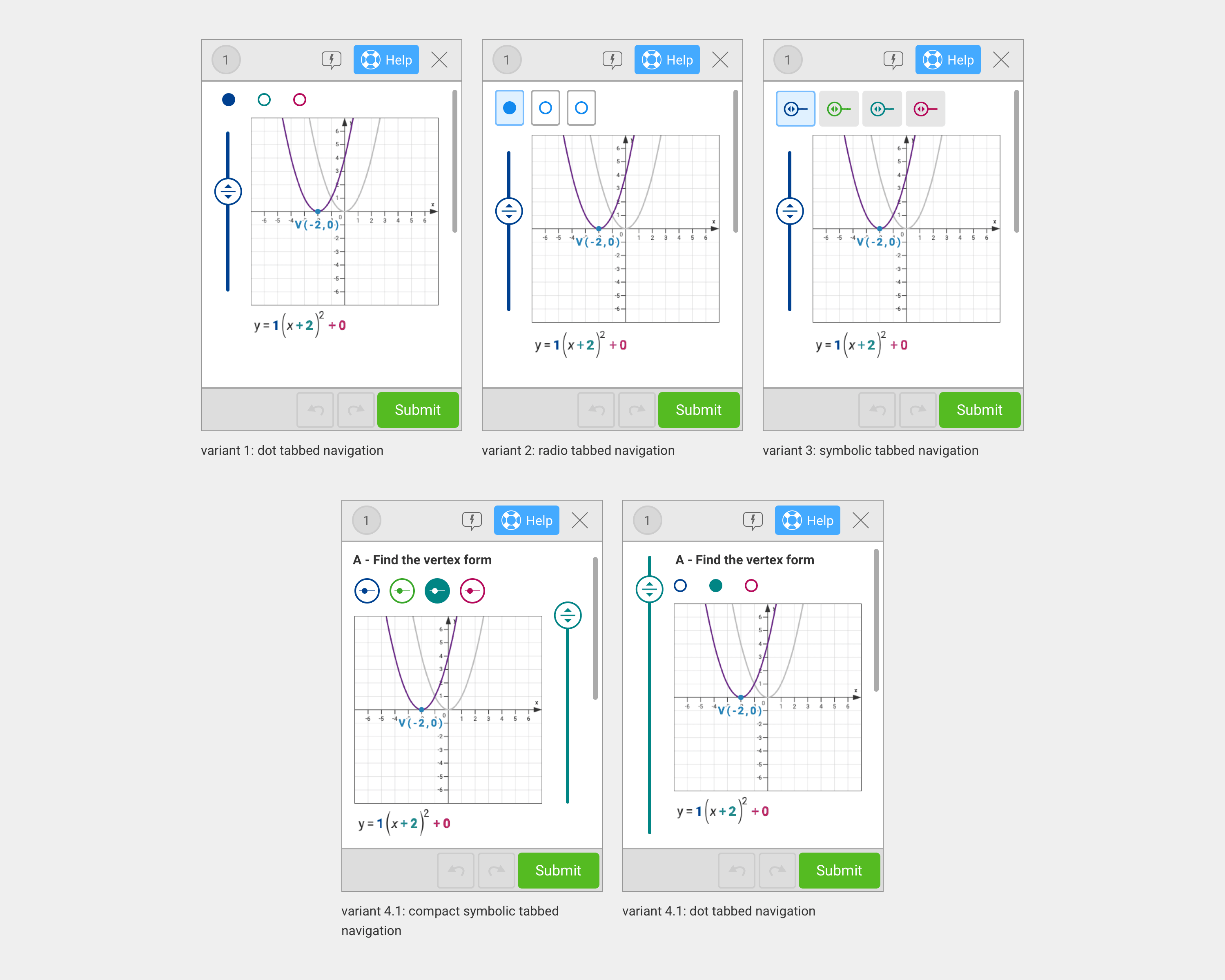
Iteration loop 1
Interactive formula with tabbed navigation system.
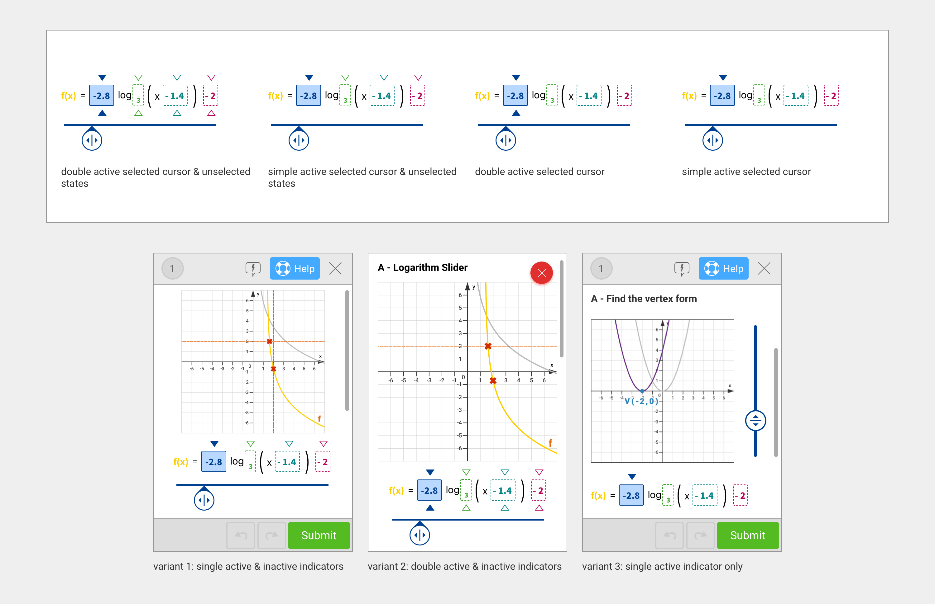
Iteration loop 1 Interactive formula with tabbed navigation system.
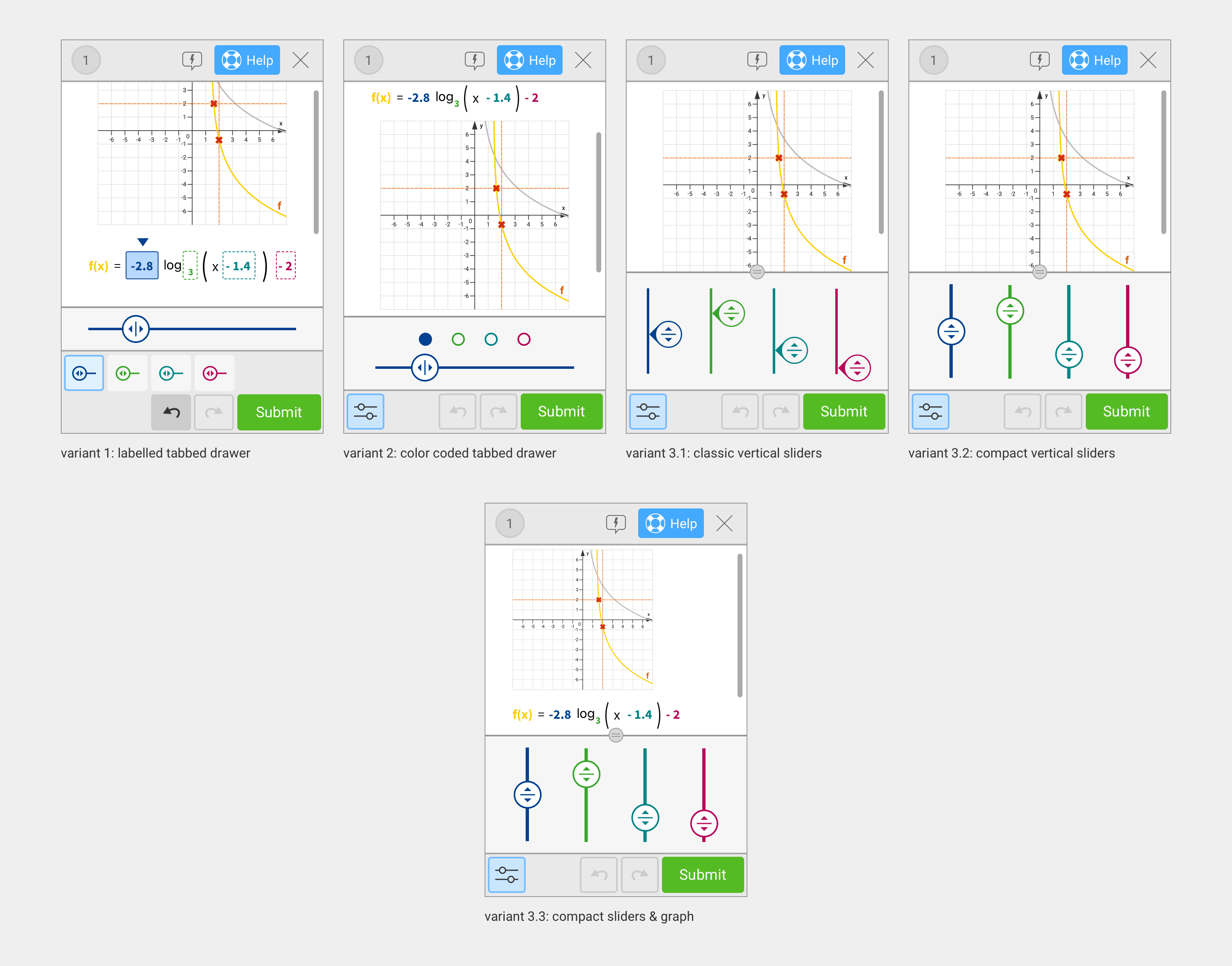
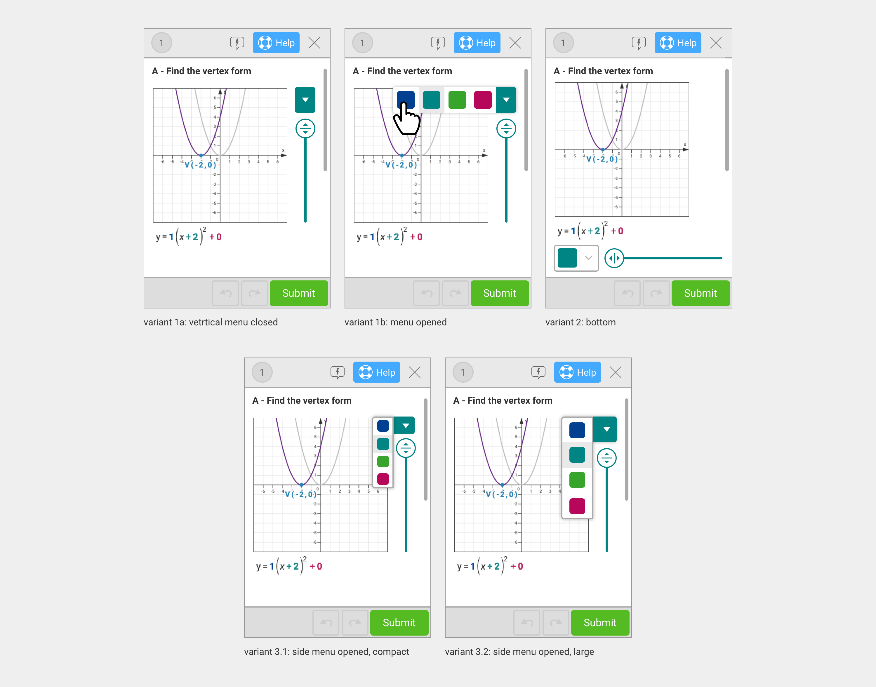
Iteration loop 2
Slider drawer systems.
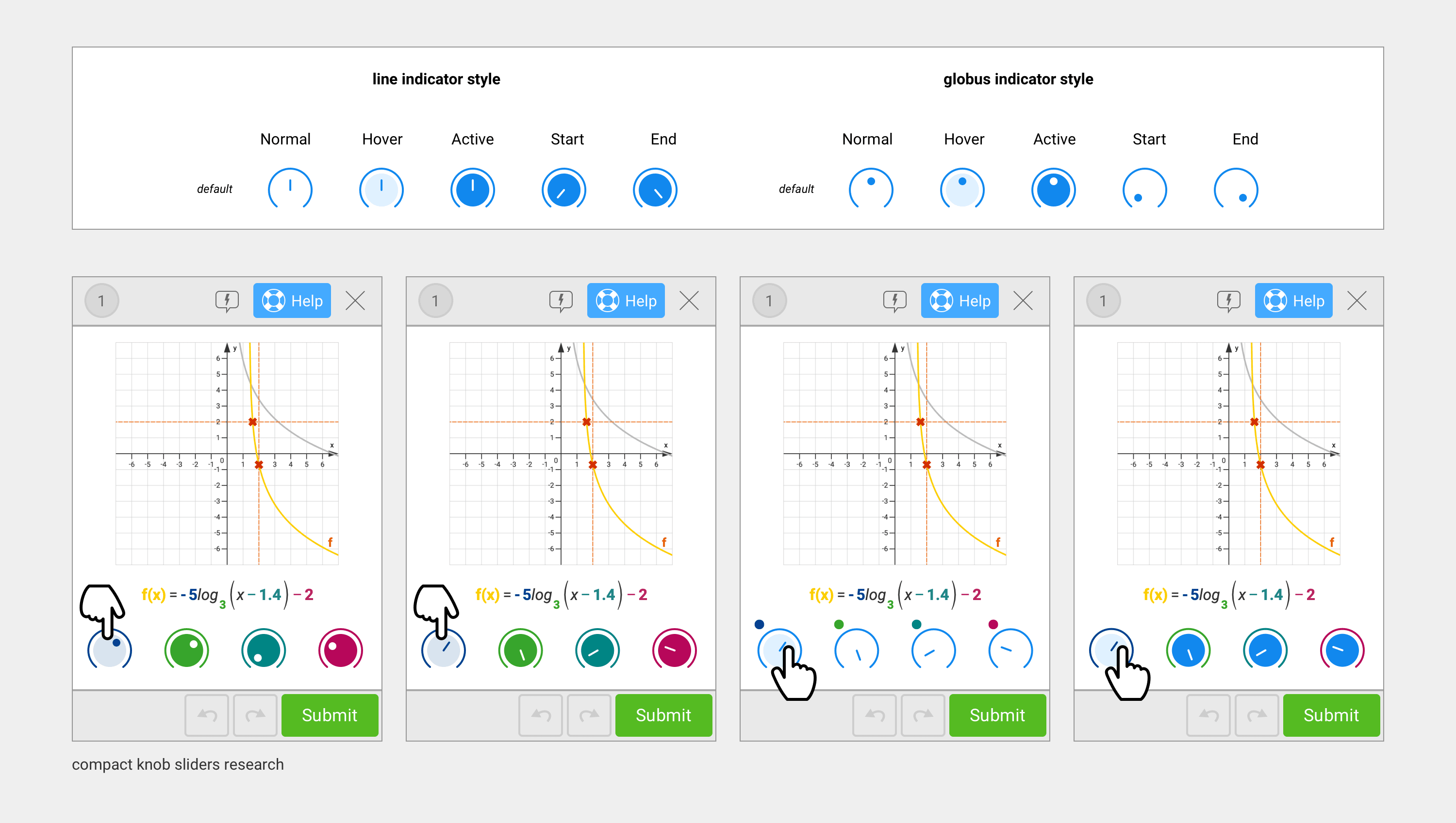
Iteration loop 3
UI research on a compact slider system with knob-style heads.
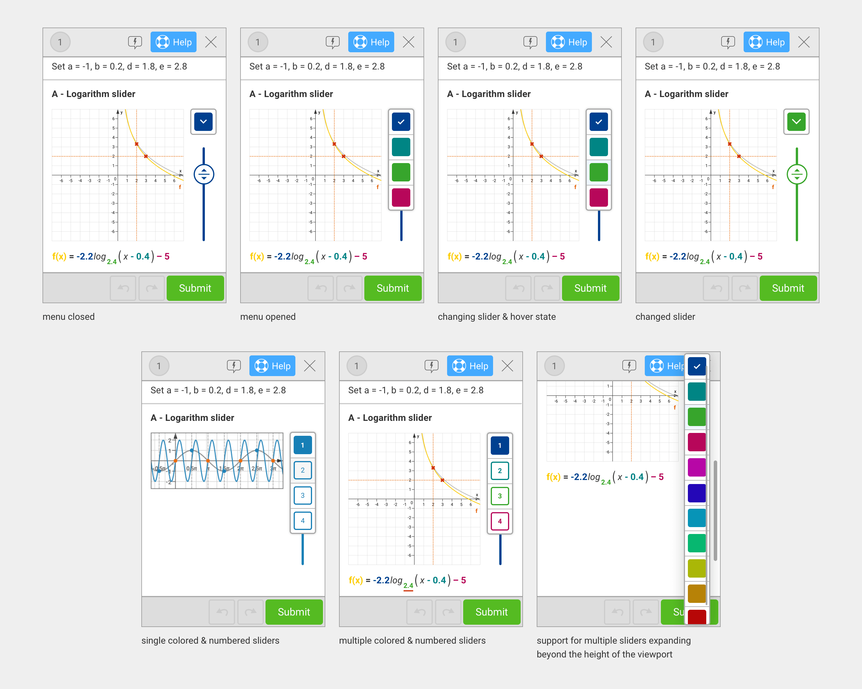
Iteration loop 4
A combination of compact sliders and tabbed navigation systems.
Iteration loop 5
Slider and menu toggle systems.
Finalizing the Gizmo
A final round of feedback and design iterations validated the solution. By implementing progressive enhancement, devices with sufficient screen space could use an extended version of the gizmo, while smaller devices utilized the optimized solution. This approach ensured that every mobile device provided the best possible user experience by maximizing the use of available space.
Making changes to the menu toggle and the compact slider system for the different types of exercises, uses, and requirements.
Creating screens for all possible combinations of error and disabled states.
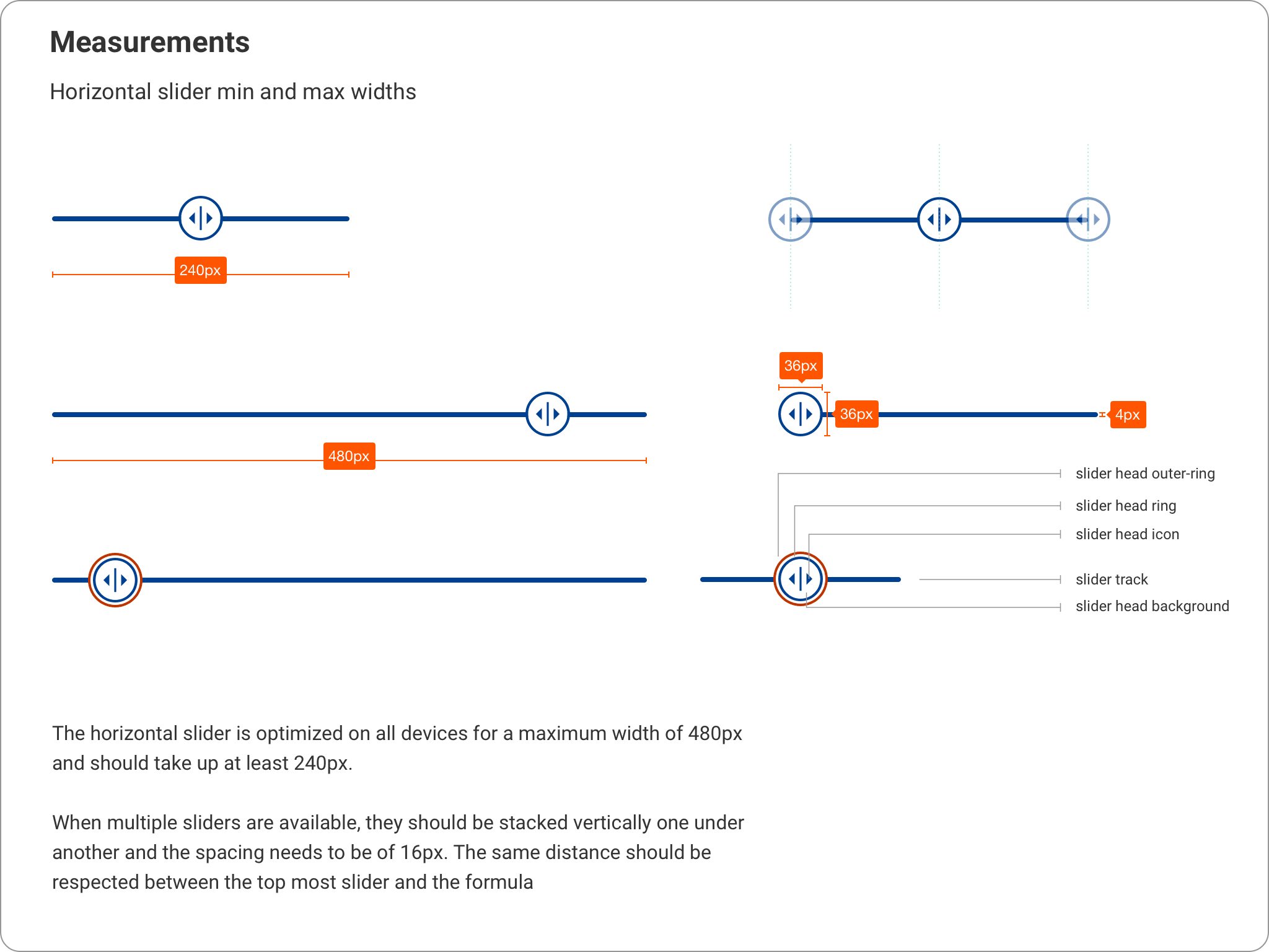
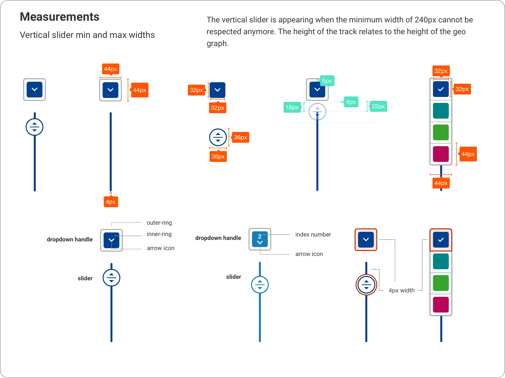
Specifications & Developer Handoff
As a final step, I created detailed specification documentation for the developers and established a set of rules and best practices to guide the implementation and future updates.